What if information designers designed a blog

A quick Google search later, we saw collated and reviewed the most common blogging systems out there from Tumblr to HubSpot. However, for some reason, none of the designs seemed to click.
Common Blog Design #1
This is the most common blog design. You generally have one or two columns, generally one main area and one sidebar. The contents of each blog post is shown in detail, one after the other. A famous blog in the technology world with this design is https://37signals.com/svn Our review: This design assumes that a reader wants to “read” each and every article on the blog and offers very less searching ability. We did not like this design.

Common Blog Design #2
On the other extreme end, is the design where a list of links are listed. Based on which articles one wants to read, one can click on the link and read that article. This design is good for blogs with a lot of content and target audience has familiarity with content. It is very similar to how most email clients are designed. Good blogs that follow this model are https://news.ycombinator.com/ and https://www.paulgraham.com/articles.html Our review: We loved this design since a typical nerdy reader would be able to traverse through a lot of articles very quickly and only open the articles he is interested in. However, a novice user mind find this approach a bit tedious or uninteresting since there is a lot of text and no images.

Common Blog Design #3
The third design is a compromise between the two extremes. In this design, all article links are listed one after the other and a 2-3 line snippet of the article is written there with a READ MORE button. Our review: While this approach seems to be the best of both worlds, according to us this design made too many compromises. One had to scroll a lot (lesser than design #1) but still a lot more than design #2. Generally the snippets were not comprehensive gists, just the first 2-3 lines of the article. This did not communicate to us if we wanted to read the article or not.

Let’s design
W.r.t. a blog, following are the various data points:
- Post titles – short, quick to view.
- Post texts – actual product that needs to be consumed.
- Author – establishes credibility and adds a face to an abstract medium.
- Tags – organises the content, allows one to filter down to the right topic one is interested in.
- Created at – Age of the post; can reflect relevance e.g. if there is an article on Rails from 2008 then it’s relevance now (in 2013) would be less considering Rails has shifted two versions since then. But if there is a generic design article from 2004 too, it might still be relevant.
Breaking the data into dimensions and facts (OLAP Dimensional modeling)
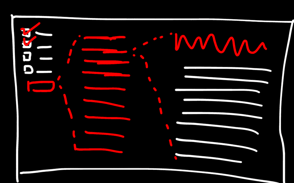
- Author, Tags, Created at are dimensions by which you can filter down to a few articles
- Post titles are the actual facts that you consume
- One selecting a post title, you can drill down to the actual post
Logical flow of data
Filter => Select title => Consume post. A reader should be able to filter down all the articles down to the exact topics of his interest, quickly read the titles, select a title and quickly read without ever leaving the page. The design has a quick traverse to drill-down to right article capability. To make the experience very good, we used AJAX and jQuery. Next we ran into an issue that all articles had the same url since all the data was loaded via AJAX. So we added a unique page for each article and then updated the URL to that exact article link when thought everything is being loaded via AJAX. This added “context”.

Pros and Cons of the design
- We have the best of every approach like in Common Blog Design #3
- We can traverse quickly like in Common Blog Design #2
- With one click without refreshing the page, you get access to the content (post)
Final Product


